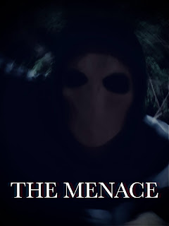
The poster for this film is gritty and rough, not even remotely as crisp as the design I'd originally looked at. On filming day, Daniel(who played the character) was standing near a tree and light just happened to reflect perfectly on the hood of his jacket. So I grabbed him and took a couple photos, and this was the result.
Although dark and dimly lit this image perfectly captures the odd energy I've been getting since I started filming. I think the blend used for the outside of the background works perfectly and the font is bold but subtle, feeling eerie with sharp edges but not too scary to make this feel like a horror movie.Friday, April 8, 2022
Subscribe to:
Post Comments (Atom)
Menace: Final Submission
Here is the link to the drive folder where I have placed the two trailers: https://drive.google.com/drive/folders/13rmIXcpFOw1RG-D7BxnRJzdZ...

-
The production process for this project has been a long road, and there have been a few major revisions that have been made since I started...
-
Chosic is such an amazing website and I'm so glad Mrs. Stoklosa mentioned it in class. Chosic is a website that allows people to search...
-
I've conducted a bit more research and I think I have a good idea as to what kind of story I want to tell and how the opening will...
No comments:
Post a Comment